UI
Opening a popup
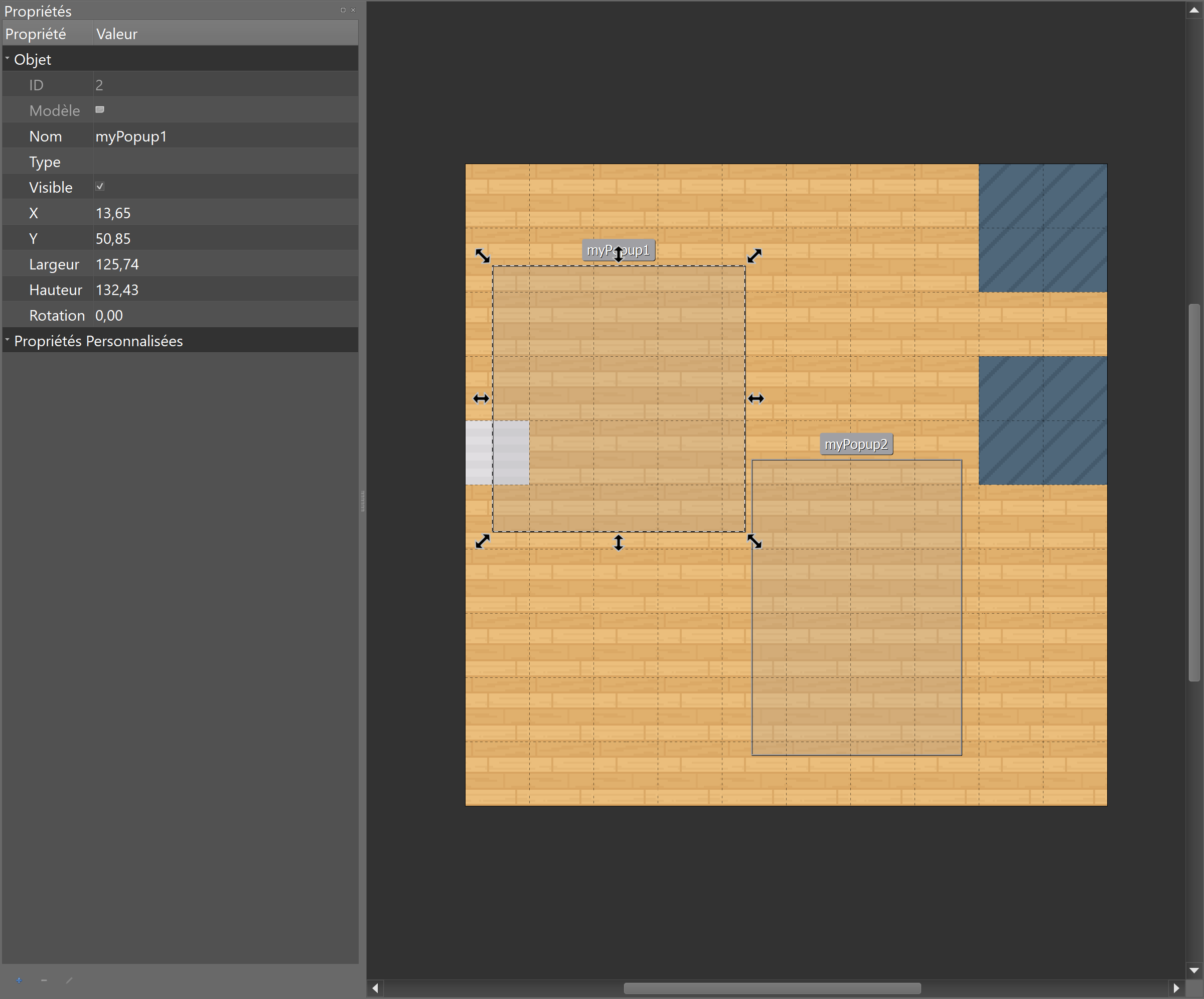
In order to open a popup window, you must first define the position of the popup on your map.
You can position this popup by using a "rectangle" object in Tiled that you will place on an "object" layer.
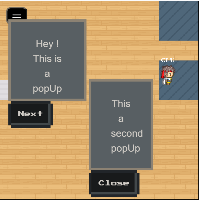
WA.ui.openPopup(targetObject: string, message: string, buttons: ButtonDescriptor[]): Popup
- targetObject: the name of the rectangle object defined in Tiled.
- message: the message to display in the popup.
- buttons: an array of action buttons defined underneath the popup.
Action buttons are ButtonDescriptor objects containing these properties.
- label (string): The label of the button.
- className (string): The visual type of the button. Can be one of "normal", "primary", "success", "warning", "error", "disabled".
- callback ((popup: Popup)=>void): Callback called when the button is pressed.
Please note that openPopup returns an object of the Popup class. Also, the callback called when a button is clicked is passed a Popup object.
The Popup class that represents an open popup contains a single method: close(). This will obviously close the popup when called.
class Popup {
    /**
     * Closes the popup
     */
    close() {};
}
Example:
let helloWorldPopup;

// Open the popup when we enter a given zone
WA.room.onEnterLayer("myZone").subscribe(() => {
    helloWorldPopup = WA.ui.openPopup("popupRectangle", 'Hello world!', [{
        label: "Close",
        className: "primary",
        callback: (popup) => {
            // Close the popup when the "Close" button is pressed.
            popup.close();
        }
    }]);
});

// Close the popup when we leave the zone.
WA.room.onLeaveLayer("myZone").subscribe(() => {
    helloWorldPopup.close();
})
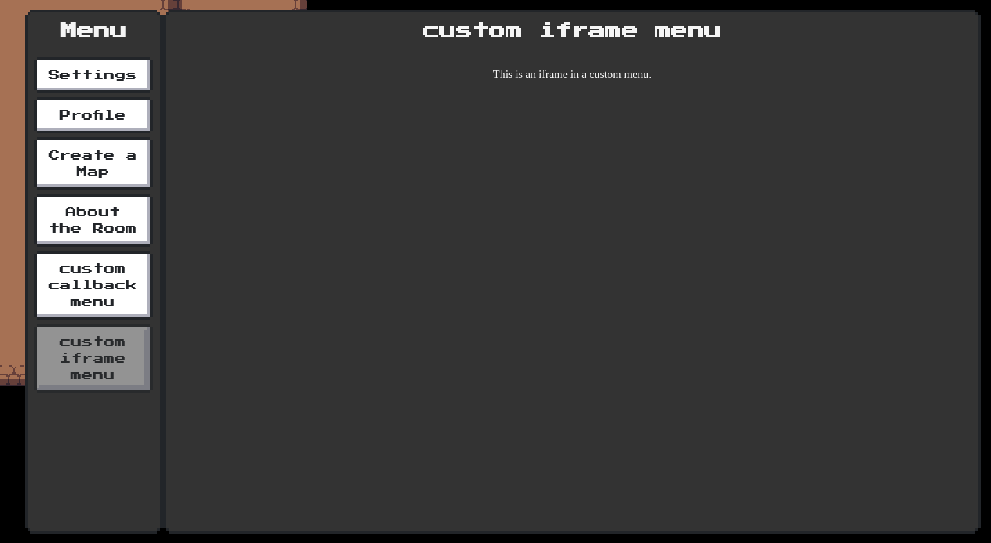
Add custom menu
WA.ui.registerMenuCommand(commandDescriptor: string, options: MenuOptions): Menu
Add a custom menu item containing the text commandDescriptor in the navbar of the menu.
options attribute accepts an object with three properties :
callback : (commandDescriptor: string) => void: A click on the custom menu will trigger thecallback.iframe: string: A click on the custom menu will open theiframeinside the menu.key?: string: A unique identifier for your menu item.allowApi?: boolean: Allow the iframe of the custom menu to use the Scripting API.allow?: string: Theallowattribute used by the iframe.
Important : options accepts only callback or iframe not both.
Custom menu exist only until the map is unloaded, or you leave the iframe zone of the script.

Example:
const menu = WA.ui.registerMenuCommand('menu test',
    {
        callback: () => {
            WA.chat.sendChatMessage('test');
        }
    })

// Some time later, if you want to remove the menu:
menu.remove();
Please note that registerMenuCommand returns an object of the Menu class.
The Menu class contains two methods: remove(): void and open(): void.
remove will remove the menu when called.
open will programmatically open the menu.
class Menu {
  /**
   * Remove the menu
   */
  public remove(): void {/*...*/};

  /**
   * Programmatically open the menu
   */
  public open(): void {/*...*/};
}
Fetching a custom menu
WA.ui.getMenuCommand(key: string): Promise<Menu>
You can retrieve a menu by its key using WA.ui.getMenuCommand.
You can also access the list of default menu items provided by WA.
Here is the full list of pre-registered keys: "settings", "profile", "credit", "globalMessages", "contact", "report".
Example: open the "invite" page from a script:
const menu = await WA.ui.getMenuCommand("profile");
menu.open();
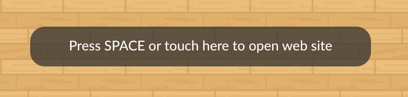
Awaiting User Confirmation (with space bar)
WA.ui.displayActionMessage({
    message: string,
    callback: () => void,
    type?: "message"|"warning",
}): ActionMessage
Displays a message at the bottom of the screen (that will disappear when space bar is pressed).
Example:
const triggerMessage = WA.ui.displayActionMessage({
    message: "press 'space' to confirm",
    callback: () => {
        WA.chat.sendChatMessage("confirmed", "trigger message logic")
    }
});

setTimeout(() => {
    // later
    triggerMessage.remove();
}, 1000)
Please note that displayActionMessage returns an object of the ActionMessage class.
The ActionMessage class contains a single method: remove(): Promise<void>. This will obviously remove the message when called.
class ActionMessage {
    /**
     * Hides the message
     */
    remove() {};
}
Adding custom ActionsMenu Action
When clicking on other player's WOKA, the contextual menu (we call it ActionsMenu) is displayed with some default Actions. It is possible to add custom actions right when player is clicked:

To do that, we need to listen for the onRemotePlayerClicked stream and make use of the remotePlayer object that is passed by as a payload.
WA.ui.onRemotePlayerClicked.subscribe((remotePlayer: RemotePlayer) => {
    remotePlayer.addAction('Ask to tell a joke', () => {
        console.log('I am NOT telling you a joke!');
    });
}
remotePlayer.addAction(actionName, callback) returns an Action object, which can remove itself from ActionsMenu:
const action = remotePlayer.addAction('This will disappear!', () => {
    console.log('You managed to click me!');
});
setTimeout(
    () => {
        action.remove();
    },
    1000,
);
Manage fixed iframes
You can use the scripting API to display an iframe (so any HTML element) above the game. The iframe is positionned relative to the browser window (so unlike embedded websites, the position of the iframe does not move when someone walks on the map).
This functonnality creates an iframe positionned on the viewport.
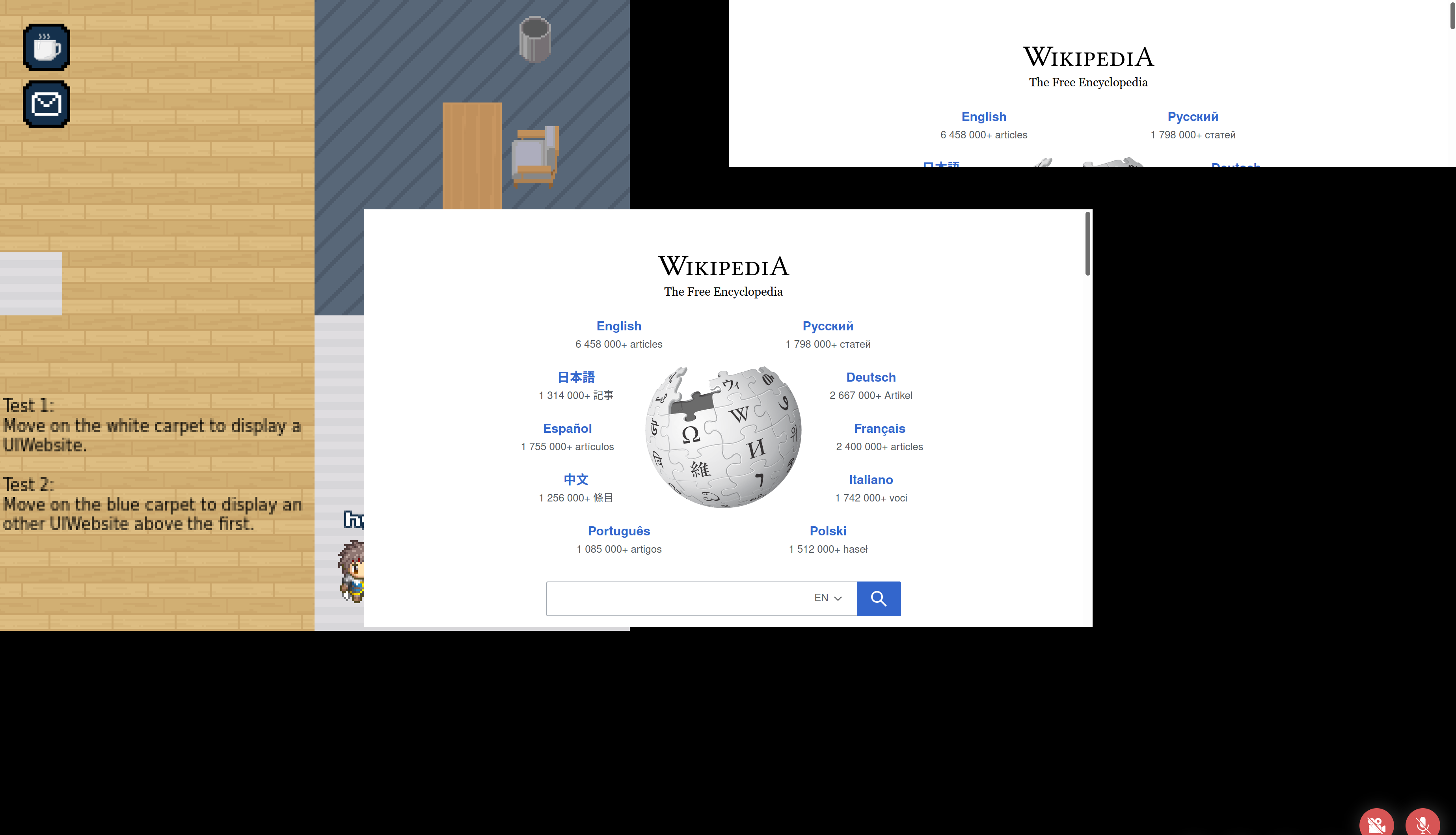
Display a UI website
WA.ui.website.open(website: CreateUIWebsiteEvent): Promise<UIWebsite>

interface CreateUIWebsiteEvent {
    url: string,            // Website URL
    visible?: boolean,      // The website is visible or not
    allowApi?: boolean,     // Allow scripting API on the website
    allowPolicy?: string,   // The list of feature policies allowed
    position: {
        vertical: "top"|"middle"|"bottom",,
        horizontal: "left","middle","right",
    },
    size: {                 // Size on the UI (available units: px|em|%|cm|in|pc|pt|mm|ex|vw|vh|rem and others values auto|inherit)
        height: string,
        width: string,
    },
    margin?: {              // Website margin (available units: px|em|%|cm|in|pc|pt|mm|ex|vw|vh|rem and others values auto|inherit)
        top?: string,
        bottom?: string,
        left?: string,
        right?: string,
    },
}

interface UIWebsite {
    readonly id: string,            // Unique ID
    url: string,                    // Website URL
    visible: boolean,               // The website is visible or not
    readonly allowApi: boolean,     // Allow scripting API on the website
    readonly allowPolicy: string,   // The list of feature policies allowed
    position: {
        vertical: string,           // Vertical position (top, middle, bottom)
        horizontal: string,         // Horizontal position (left, middle, right)
    },
    size: {                         // Size on the UI (available units: px|em|%|cm|in|pc|pt|mm|ex|vw|vh|rem and others values auto|inherit)
        height: string,
        width: string,
    },
    margin?: {                      // Website margin (available units: px|em|%|cm|in|pc|pt|mm|ex|vw|vh|rem and others values auto|inherit)
        top?: string,
        bottom?: string,
        left?: string,
        right?: string,
    },
    close(): Promise<void>,         // Close the current website instance
}
You can open a website with the WA.ui.website.open() method. It returns an Promise<UIWebsite> instance.
const myWebsite = await WA.ui.website.open({
    url: "https://wikipedia.org",
    position: {
        vertical: "middle",
        horizontal: "middle",
    },
    size: {
        height: "50vh",
        width: "50vw",
    },
});

myWebsite.position.vertical = "top";
The url parameter can be a relative URL. In this case, the URL is relative to the map file.
Close a UI website
You can close a website with the close function on the UIWebsite object
myWebsite.close();
Get all UI websites
You can get all websites with the WA.ui.website.getAll() method. It returns an Promise<UIWebsite[]> instance.
WA.ui.website.getAll();
Get UI website by ID
You can get a specific website with the WA.ui.website.getById() method. It returns an Promise<UIWebsite> instance.
If your code is running inside a UIWebsite iframe, you can use WA.iframeId to obtain the id of the current iframe.
const websiteId = WA.iframeId;
const website = await WA.ui.website.getById(websiteId);
The modal iframe API
Open the modal iframe
WA.ui.modal.openModal({
    src: string,
    allow?: string,
    allowApi?: boolean, // optional by default false.
    position?: string,
    allowFullScreen?: boolean,
    title: string,
    closeCallback?: (event: ModalEvent) => void
}): void
src(string, mandatory): the URL of the iframe modal (mandatory).allow(string, optional, default ""): the list of permission policies allowed.allowApi(boolean, optional, defaultfalse): if set totrue, the iframe will be able to use the scripting API.position(string, optional, defaultright): the position of the modal. Possible values arecenter,left,right.allowFullScreen(boolean, optional, defaulttrue): if set tofalse, the "fullscreen" button next to the close button will be hidden.title: the title of the iframe (note: this is mostly useless since the title is not displayed).closeCallback(function, optional): a function that will be called when the modal is closed. The function will be passed theModalEventobject used to configure the modal.
Example
Opening a modal in the center of the screen:
WA.ui.modal.openModal({
    title: "WorkAdventure website",
    src: 'https://workadventu.re',
    allow: "geolocation",
    allowApi: true,
    position: "center",
    allowFullScreen: false,
    () => {
        console.info('The modal was closed');
    }
});
Opening a modal on the right side:
    WA.ui.modal.openModal({
        title: "WorkAdventure website",
        src: 'https://workadventu.re',
        allow: "fullscreen",
        position: "right"
    });
Opening a modal on the left side:
    WA.ui.modal.openModal({
        title: "WorkAdventure website",
        src: 'https://workadventu.re',
        position: "left"
    });
Mobile example
If the user is in mobile definition, the modal will open in full screen:
Closing a modal
WA.ui.modal.closeModal(): void
Action bar button API
Add a button in the action bar
WA.ui.actionBar.addButton(descriptor: AddButtonActionBar): void
With AddButtonActionBar defined as:
interface AddButtonActionBar {
    /*
     *   the id of the button action bar defined.
     */
    id: string,

    /*
     *   the label to display in button action bar.
     */
    label: string

    /*
     *  the image of button associated, This parameter is nullable.
     */
    imageSrc: string

    /*
     *   the label displayed above the action button. This parameter is nullable.
     */
    toolTip: string

    /*
     *   specifies the background color of the button. This parameter is nullable.
     */
    bgColor: string

    /*
     *   specifies the button text color. This parameter can be null.
     */
    textColor: string

    /*
     *   specifies if the button is a gradient button or not. False by default. When true, a gradient is applied to the button with the 'bgColor' parameter.
     */
    isGradient: boolean

    /*
     * Where the button must be added
     */
    location: "top"|"appsMenu"|"buildMenu"|"profileMenu"|undefined,
}
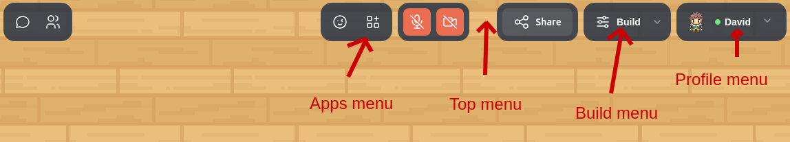
The action bar contains several menus that can contain buttons. The location option
allows you to decide in which menu you want the button to appear. Possible values are:
top: the button will appear directly in the action bar (default value).appsMenu: the button will appear in the "Apps" menu (center-left). The apps menu is typically used to display 3rd party application integrations.buildMenu: the button will appear in the "Build" menu (right). The build menu is typically used to display access to the map-editor and to important map-related features. This is typically reserved for map owners and administrators.profileMenu: the button will appear in the "Profile" menu (right-most).
Remove a button from the action bar
WA.ui.actionBar.removeButton(id: string);
- id: the id of the action bar button previously defined.
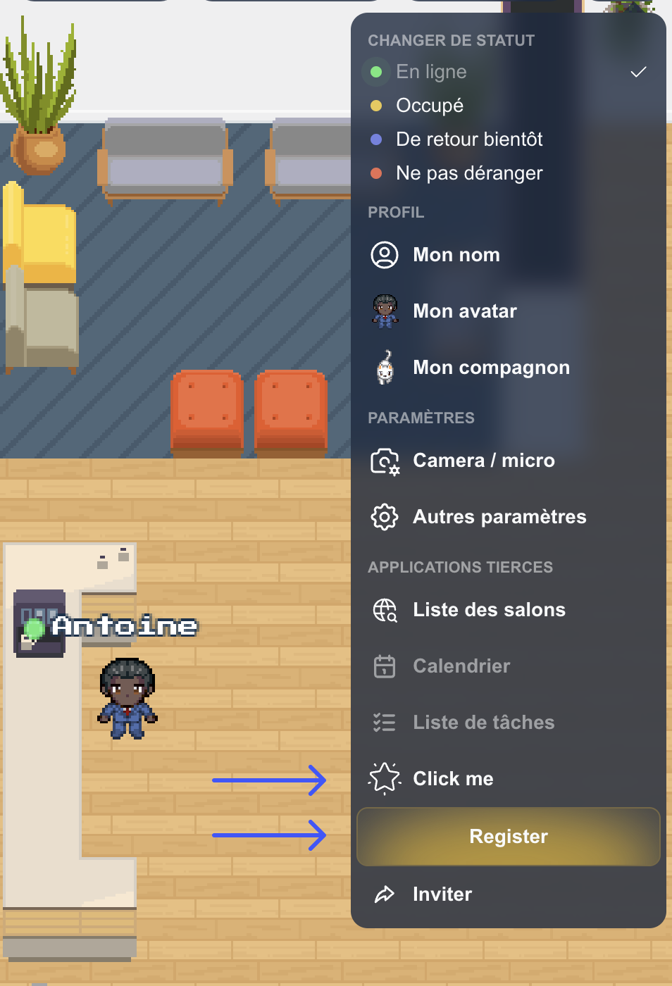
Example of an icon only action bar button
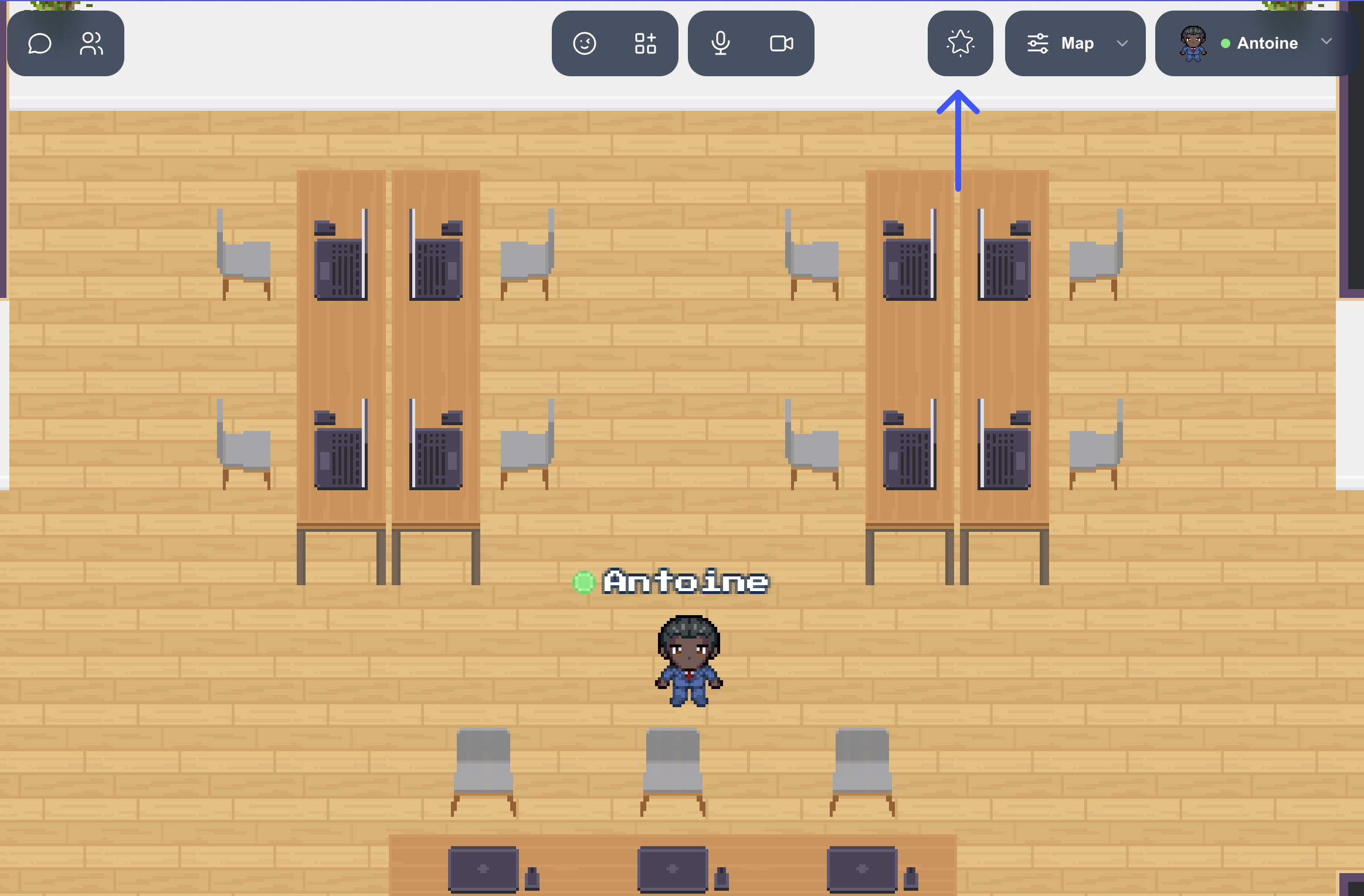
    // Add action bar button 'Register'.
    WA.ui.actionBar.addButton({
        id: 'icon-btn',
        imageSrc: '<Your image url>',
        toolTip: 'Click me',
        callback: (event) => {
            console.log('Button clicked', event);
            // When a user clicks on the action bar button 'Register', we remove it.
            WA.ui.actionBar.removeButton('icon-btn');
        }
    });
Example of an action bar button with gradient
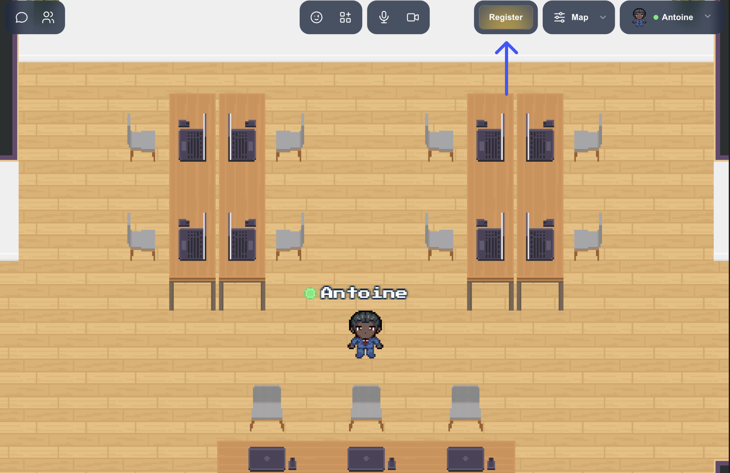
    // Add action bar button 'Register'.
    WA.ui.actionBar.addButton({
        id: 'gradient-btn',
        label: 'Register',
        bgColor: '#edb911',
        isGradient: true,
        callback: (event) => {
            console.log('Button clicked', event);
            // When a user clicks on the action bar button 'Register', we remove it.
            WA.ui.actionBar.removeButton('gradient-btn');
        }
    });
Note that when the screen is too small, buttons are added to the right menu of the action bar. In this case, the button is displayed with an image and a tooltip, while for the gradient button, it retains its color and its text remains centered.
Open / Close banner
The open/close banner API is experimental. It means the compatibility with future versions of WorkAdventure is not guaranteed and we might break the signature of these methods at any moment. Use at your own risk.
Open the banner
    WA.ui.banner.openBanner({
        id: string,
        text: string,
        bgColor?: string,
        textColor?: string,
        closable?: boolean,
        link?: {
            url: string,
            label: string
        }
    });
- id: Id of the banner component,
- text: dexcription displyed in the banner,
- bgColor (optional): background color of your banner,
- textColor (optional): text color into the banner,
- closable (optional): let the possoibility for the user to close the banner. By default is
true, - timeToClose (optional): let the possibility for the user to define the time (in milliseconds) to close. If set to 0, the banner will not close automatically. By default is
120000 - link (optional): link added into the banner. The link has two mandatory parameter
urlandlabel:- url: Url link,
- label: text dsiplayed for the banner link.
Close the banner
WA.ui.banner.closeBanner();
Example of banner opened
WA.ui.banner.openBanner({
    id: "banner-test",
    text: "Banner test",
    bgColor: "#000000",
    textColor: "#ffffff",
    closable: false,
    timeToClose: 120000,
    link: {
        label: "Test",
        url: "https://workadventu.re"
    }
});
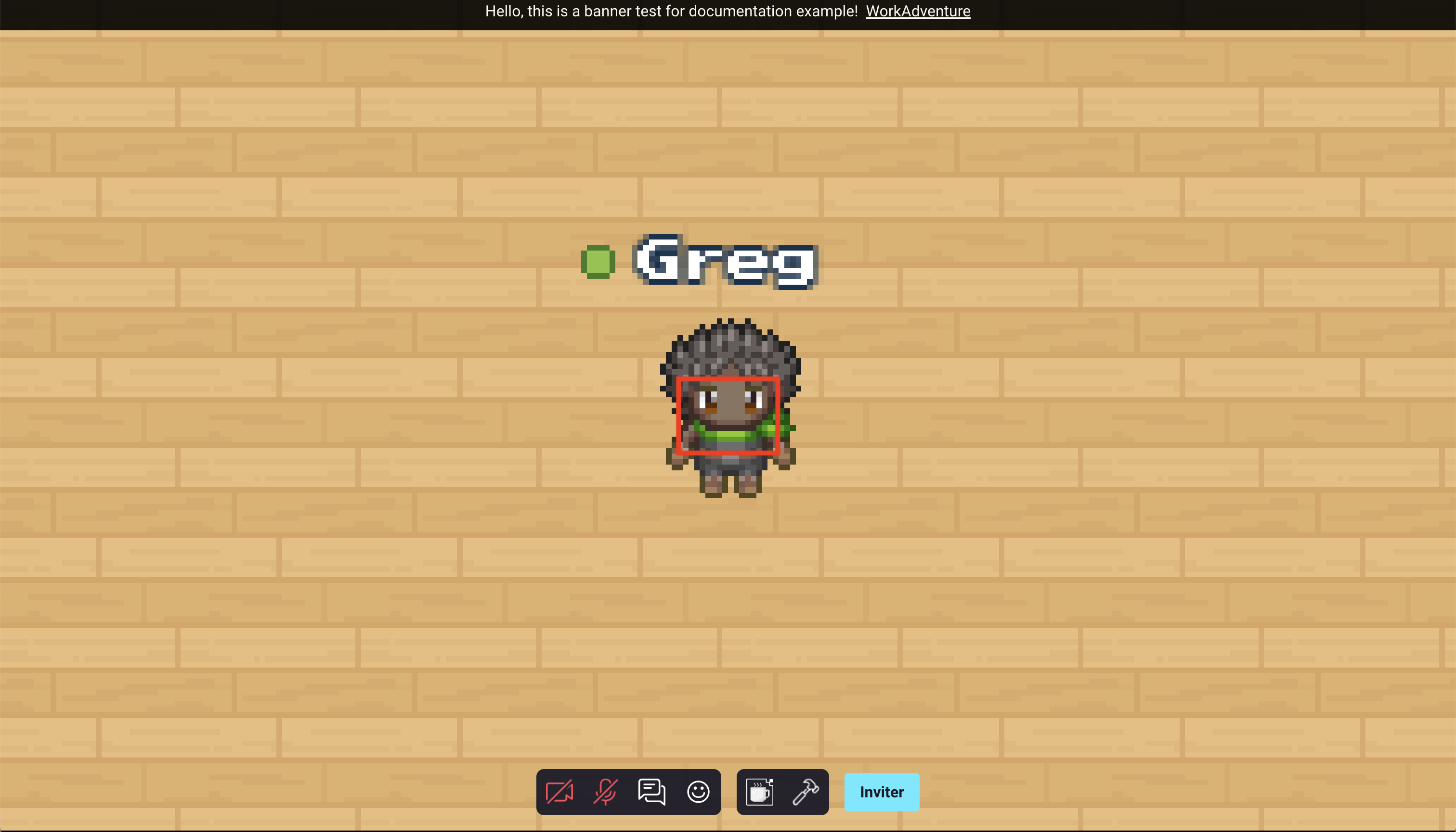
Example of banner closed
WA.ui.banner.closeBanner();
Play a video
The "play a video" API is experimental. It means the compatibility with future versions of WorkAdventure is not guaranteed and we might break the signature of these methods at any moment. Use at your own risk.
Plays a video. The video will be displayed as if it was a user talking to us.
WA.ui.playVideo(videoUrl: string, config: VideoConfig = {
  loop: true,
}): Promise<Video>;

interface VideoConfig {
  loop?: boolean;
  name:? string;
  avatar:? string;
}
Arguments:
videoUrl: the URL of the video to play.config: an object with the following optional properties:loop: whether the video should loop or not. Default istrue.name: The name displayed at the bottom left of the video.avatar: The avatar displayed at the bottom left of the video.
Return value:
- a
Promisethat resolves to aVideoobject. TheVideoobject has astopmethod that can be used to stop the video.
interface Video {
  stop(): void;
}
Example:
const video = await WA.ui.playVideo('https://example.com/video.mp4', { loop: true });

// Later, stop the video
await video.stop();